Badges
A badge is a small piece of text shown on a tab — perfect for unread counts, alarm states, or "X on" summaries.
Entity badge
Set badge to an entity id and the badge shows that entity's state:
yaml
tabs:
  - name: Inbox
    icon: mdi:email
    badge: sensor.unread_count
    card: { ... }
Template badge
Set badge to a Jinja template (anything containing {{ or {%) and it is rendered live over the HA websocket:
yaml
tabs:
  - name: Lights
    icon: mdi:lightbulb-group
    badge: >-
      {{ states.light | selectattr('state','eq','on') | list | count }}
    card: { ... }
Count badge (no Jinja)
Count entities by pattern, without writing a template:
yaml
tabs:
  - name: Lights
    icon: mdi:lightbulb-group
    badge:
      count: light.*              # one pattern or a list; * matches anything
      state: "on"                 # optional: a state or list of states
      area: living_room           # optional: only this area (device areas count)
card: { ... }- Without
state, it counts entities that are active (on, open, home, playing, a number above 0, …). - Patterns can be several:
count: [light.*, switch.*_lamp]. - Count badges are YAML; the visual editor keeps them when you edit other fields.
Badge icon (badge_icon)
Show an icon as the badge instead of text:
yaml
    badge: binary_sensor.washer_done
    badge_icon: mdi:check-bold      # shown while the badge is active
Without a badge, the icon is always shown, which is handy for marking a tab.
Progress ring (ring)
Draw a ring around the tab's icon that fills with a value, such as a battery level or a washing machine's progress:
yaml
tabs:
  - name: Washer
    icon: mdi:washing-machine
    ring: sensor.washer_progress   # entity id, template or number
    ring_max: 100                  # default 100
ring_color: "#4caf50" # optional- Values are clamped to 0–
ring_max; a non-numeric state (unavailable) shows no ring. - Colours:
ring_color, or the--tabdeck-ring-colorand--tabdeck-ring-trackvariables. - The ring needs the tab to show its icon.
Behaviour notes
- A plain string that is neither an entity id nor a template is shown verbatim.
- An empty or unresolved template renders no badge (rather than
unknown). - Template badges update automatically when their inputs change.
Numeric formatting: badge_format
Numeric badges can be rounded, capped and given a unit. Set badge_format on a tab, or at the top level as a default for every tab (a tab's own badge_format wins).
| Key | Type | Effect |
|---|---|---|
precision | integer 0–6 | Round to this many decimal places (21.456 → 21.5 with 1). |
max | number | Values above it show as <max>+ (150 → 99+ with 99). |
unit | string | Appended to the value (include a leading space if you want one: " W"). |
yaml
type: custom:tabdeck-card
badge_format: { max: 99 }          # default: cap every count at 99+
tabs:
  - name: Living
    badge: sensor.living_room_temperature
    badge_format: { precision: 0, unit: "°" }
    card: { ... }
  - name: Solar
    badge: sensor.solar_power
    badge_format: { unit: " W", max: 9999 }
    card: { ... }
  - name: Activity
    badge: sensor.activity_count  # 485 → 99+ via the top-level default
    card: { ... }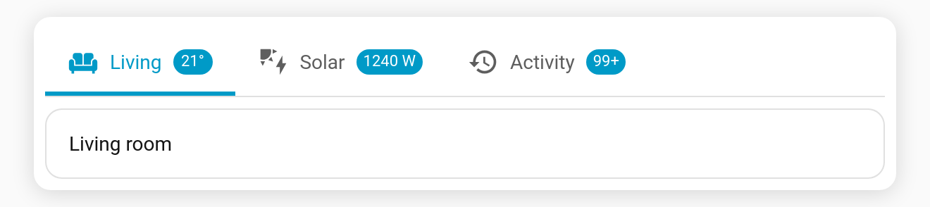
- Non-numeric values (
on,Open, …) are shown unchanged. - With
badge_display: dot, no text is shown, so formatting doesn't apply. - Any numeric zero (
0,0.0,-0) counts as inactive, sohide_inactive_badgehides it and dot mode shows no dot.