Extra bar styles: boxed and text
In addition to underline, pill, and segmented, Tabdeck offers two more bar styles.
Config key: style (top-level) · New values: boxed · text
boxed
Each tab is its own bordered chip; the selected chip gets a tinted accent fill.
type: custom:tabdeck-card
style: boxed
tabs:
  - { name: Climate, icon: mdi:thermostat, accent: "#e8743b", card: { ... } }
  - { name: Lights, icon: mdi:lightbulb-group, card: { ... } }
  - { name: Eco, icon: mdi:leaf, card: { ... } }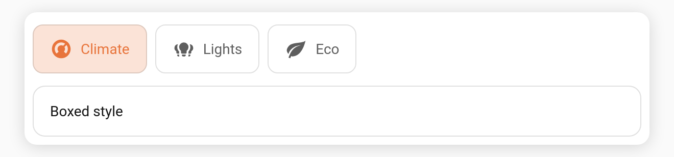
text
No indicator and no borders — the selected tab is shown purely by colouring its label/icon. The most minimal look.
type: custom:tabdeck-card
style: text
tabs: [ ... ]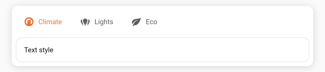
rail
A compact icon rail — centred tabs with a rounded selection highlight. Designed to pair with position: left/right and tab_display: icon (often with header for the active title).
type: custom:tabdeck-card
position: left
style: rail
tab_display: icon
header: true
tabs: [ ... ]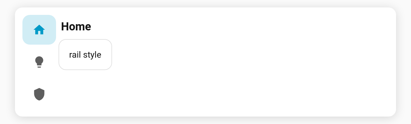
Indicator corner radius
indicator_radius (px) overrides the corner radius of the pill/segmented/boxed/rail indicator — e.g. indicator_radius: 4 for a squarer highlight, 0 for sharp corners.
Notes
- All styles respect
accent_indicatorand per-tabaccent. - Pick the style from the Style dropdown in the visual editor.
Expanding side rail (rail_expand)
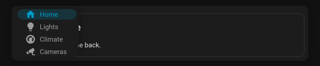
For position: left or right, rail_expand: true keeps the bar as a slim icon rail. Hovering it, or moving keyboard focus into it, slides the labels out over the content, so nothing reflows. Moving away collapses it again.
type: custom:tabdeck-card
position: left
style: rail
rail_expand: true
tabs: [ ... ]| Collapsed | Hovered |
|---|---|
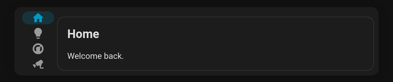 |  |
Set the collapsed width with --tabdeck-rail-width (default 64px). It has no effect on top or bottom bars.