Responsive layouts: split view & narrow display
The deck can change its layout based on its own width (not the screen's), so it adapts to where it sits in a dashboard.
Split view (split)
On a wide card, show every tab side by side as titled columns and hide the tab bar. Below the threshold it's a normal tabbed deck again. You get tabs on a phone and columns on a desktop.
yaml
type: custom:tabdeck-card
split: 900                  # side by side when the card is ≥ 900 px wide
tabs: [ ... ]
or with a column count:
yaml
split:
  min_width: 700
  columns: 3                # 2–4, default 2
- Each column gets a title (the tab's icon and name) above its card.
- With more tabs than columns, the extra ones wrap onto further rows.
- Navigation/action tabs have no content, so they're left out.
- Column spacing is set by
--tabdeck-split-gap(default16px).
Narrow display (tab_display_narrow)
Use a different tab display mode when the card is narrow. A typical setup is icon-only tabs on phones with icon and label everywhere else.
yaml
type: custom:tabdeck-card
tab_display: both
tab_display_narrow: icon    # both | icon | label | active
narrow_width: 450           # "narrow" = card width below this (default 450)
tabs: [ ... ]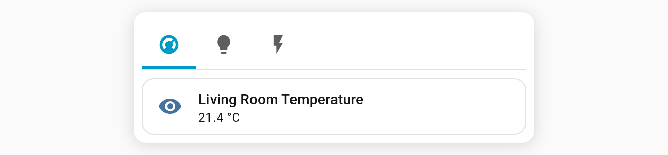
Notes
- The width is measured live with a
ResizeObserver, so layouts switch as you resize the window or change dashboard columns. It's only observed when one of these options is set. - All options are in the visual editor. The split column count is YAML-only, and it's kept when you change the width in the editor.