Disabled tabs
Show a tab greyed-out and non-selectable instead of hiding it. Useful for "coming soon" tabs or to indicate a feature that's temporarily unavailable.
Per-tab key: disabled (boolean)
yaml
type: custom:tabdeck-card
tabs:
  - name: Home
    icon: mdi:home
    card: { ... }
  - name: Setup
    icon: mdi:cog
    disabled: true        # visible but greyed out
    card: { ... }
  - name: Energy
    icon: mdi:flash
    card: { ... }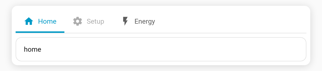
Behaviour
- A disabled tab is rendered at reduced opacity and cannot be clicked.
- Keyboard navigation skips disabled tabs, and Home/End land on the first/last enabled tab.
- Difference from visibility: visibility removes a tab from the bar;
disabledkeeps it visible but inert. - Toggle it from the Disable tab switch in the visual editor.