Grouped tabs (sub-tabs & dropdown menus)
A tab can hold its own tabs. Give it children: (a list of ordinary tabs) instead of a card.
Second-level row (default)
The children appear as a compact second row of tabs under the bar.
yaml
- name: Climate
  icon: mdi:thermostat
  children:
    - { name: Downstairs, card: { ... } }
    - { name: Upstairs, card: { ... } }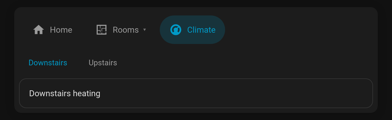
Dropdown menu
With children_display: menu the parent tab gets a ▾ and opens a menu of its children. Picking one opens it, and the parent tab's subtitle shows which child is open. The menu supports the keyboard: Enter/Space opens it, ↑ ↓ move, Esc closes.
yaml
- name: Rooms
  icon: mdi:floor-plan
  children_display: menu
  children:
    - { name: Kitchen, icon: mdi:fridge, card: { ... } }
    - { name: Lounge, icon: mdi:sofa, card: { ... } }
    - { name: Garage, icon: mdi:garage, card: { ... } }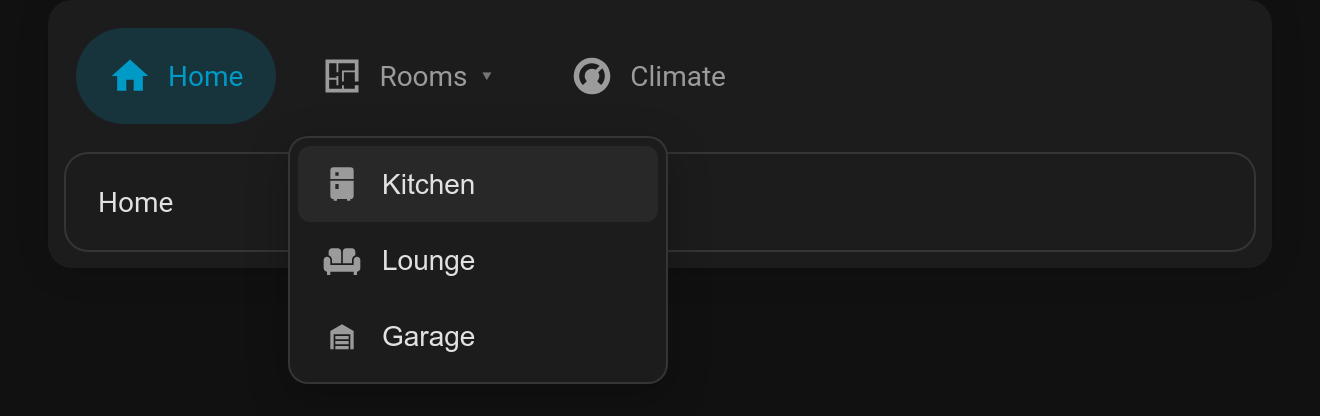
Options
children: a list of tabs. Each child supports every normal tab option (visibility,badge,cards, …).children_display:row(default) ormenu.children_options: any Tabdeck card options for the inner deck, merged over the compact defaults (style: text, 36px tabs). For example,children_options: { style: pill, remember: browser }.
A grouped tab is a nested Tabdeck deck under the hood, so everything a deck can do works inside a group. In the visual editor, Edit card on a grouped tab opens the inner deck's editor, and your changes are saved back to children.
Related: hide_bar and the public API
hide_bar: truerenders only the content, with no tab bar. The menu mode uses it, and it's handy for a deck that's driven byremember: entity,auto_selector a script.- Every Tabdeck card exposes
selectTab(nameOrIndex)(returnstrue/false; names match exactly or by slug, e.g.living-room) andselectedTab(the active tab's name). It also fires atabdeck-tab-changedevent (detail: { index, name, deck }, bubbling and composed) whenever the active tab changes. Use these from browser_mod, custom cards or your own JavaScript.