Accent-coloured indicator
Give each tab its own accent colour and the selection indicator, icon, and label adopt that colour when the tab is active. Turn it off for a single theme-coloured indicator.
Config key: accent_indicator (top-level boolean, default true) · Per-tab: accent (CSS colour)
yaml
type: custom:tabdeck-card
accent_indicator: true        # default; set false for a uniform indicator
tabs:
  - name: Climate
    icon: mdi:thermostat
    accent: "#e8743b"
    card: { type: thermostat, entity: climate.living_room }
  - name: Lights
    icon: mdi:lightbulb-group
    accent: "#3b82e8"
    card: { type: entities, entities: [light.kitchen] }
  - name: Eco
    icon: mdi:leaf
    accent: "#2faa54"
    card: { type: entities, entities: [sensor.power] }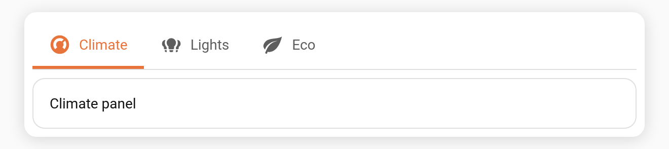
Behaviour
- When
accent_indicator: true(default), the moving indicator takes the selected tab'saccent. As you switch tabs the colour follows. - A tab without an
accentfalls back to the theme's--primary-color. - When
accent_indicator: false, the indicator is always--primary-color, regardless of per-tab accents. - Works with all three bar styles (
underline,pill,segmented).
Toggle it from the Colour indicator by tab accent switch in the visual editor.