Tab display mode
Choose whether the tab bar shows icons, labels, or both — or icons only, with the selected tab expanded to its name and subtitle. Great for compact bars on mobile or icon-driven dashboards.
Config key: tab_display (top-level) · Values: both (default) · icon · label · active
yaml
type: custom:tabdeck-card
tab_display: icon      # both | icon | label | active
style: pill
tabs:
  - name: Climate
    icon: mdi:thermostat
    card: { type: thermostat, entity: climate.living_room }
  - name: Lights
    icon: mdi:lightbulb-group
    card: { type: entities, entities: [light.kitchen] }
  - name: Security
    icon: mdi:shield-home
    card: { type: entities, entities: [alarm_control_panel.home] }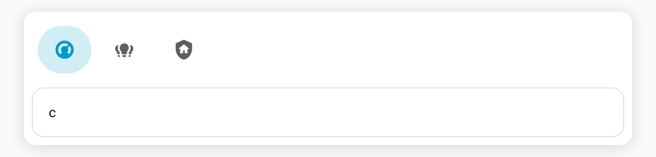
Behaviour
| Value | Shows |
|---|---|
both | Icon and label (the classic look). |
icon | Icon only — but a tab with no icon still shows its label, so a tab is never empty. |
label | Label only; icons are hidden. |
active | Icon only on unselected tabs; the selected tab shows its icon, name and subtitle. Tabs without an icon keep their label. |
Set it globally in the card config, or pick it from the Tab display dropdown in the visual editor.
Expand the selected tab (active)
Compact like icon, but the active tab spells out where you are — including its subtitle:
yaml
type: custom:tabdeck-card
tab_display: active
style: pill
tabs:
  - name: Climate
    subtitle: 21.5 °C
    icon: mdi:thermostat
    card: { type: thermostat, entity: climate.living_room }
  - name: Lights
    subtitle: 3 on
    icon: mdi:lightbulb-group
    card: { type: entities, entities: [light.kitchen] }
  - name: Security
    subtitle: Armed
    icon: mdi:shield-home
    card: { type: entities, entities: [alarm_control_panel.home] }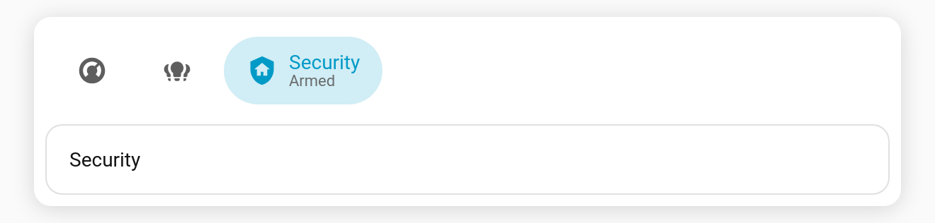
The indicator follows the expanding tab as you switch.
Tips
- Pair
tab_display: iconwith thepillorsegmentedstyle for a clean app-style switcher. - Give every tab an
iconwhen usingiconmode so the bar stays consistent.
To switch display mode automatically on narrow cards, see
tab_display_narrow.