Pagination dots & content arrows
Two options for carousel-style decks: slideshows, wall panels and "swipe through my rooms" cards.
Dots
tab_display: dots replaces the tab bar with a centred row of pagination dots. The current tab's dot stretches into a pill in the accent colour, and an alerting tab's dot turns red. Screen readers still hear each tab's name.
Content arrows
content_arrows: true adds ‹ › buttons beside the content to step to the previous or next tab. They skip disabled and action tabs, disappear at the ends, and wrap around with swipe_wrap: true. The arrows sit in their own side gutters, so they never cover a card's switches or sliders.
type: custom:tabdeck-card
tab_display: dots
content_arrows: true
swipe: true          # swipe on phones too
swipe_wrap: true
tabs: [ ... ]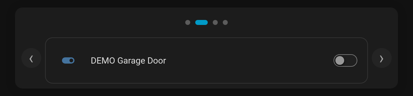
Theming: --tabdeck-dot-size (8px), --tabdeck-arrow-gutter (40px), --tabdeck-arrow-opacity (0.7). Both options are in the visual editor (Tab display → Dots, and the Previous / next arrows toggle).