Elements
An element template holds a single element of a
Picture Elements card — an
icon, a state icon, a state label, an image, a button and so on.
This is the one that saves the most typing, because floorplans repeat the same marker over and over with nothing different but the entity and the coordinates.
decluttering_templates:
  room_marker:
    element:
      type: state-icon
      entity: '[[light]]'
      tap_action:
        action: toggle
      style:
        '--paper-item-icon-color': white
        background-color: rgba(30, 41, 59, 0.75)
        border-radius: 50%
        padding: 6px
Use it in a Picture Elements card’s elements: list. Positioning goes on the instance,
in its own style: mapping:
- type: picture-elements
  image: /local/floorplan.svg
  elements:
    - type: custom:decluttering-card-plus
      template: room_marker
      variables:
        - light: light.living_room
      style:
        top: 32%
        left: 26%
    - type: custom:decluttering-card-plus
      template: room_marker
      variables:
        - light: light.kitchen
      style:
        top: 32%
        left: 72%
    - type: custom:decluttering-card-plus
      template: room_marker
      variables:
        - light: light.bedroom
      style:
        top: 84%
        left: 26%
    - type: custom:decluttering-card-plus
      template: room_marker
      variables:
        - light: light.hallway
      style:
        top: 84%
        left: 72%
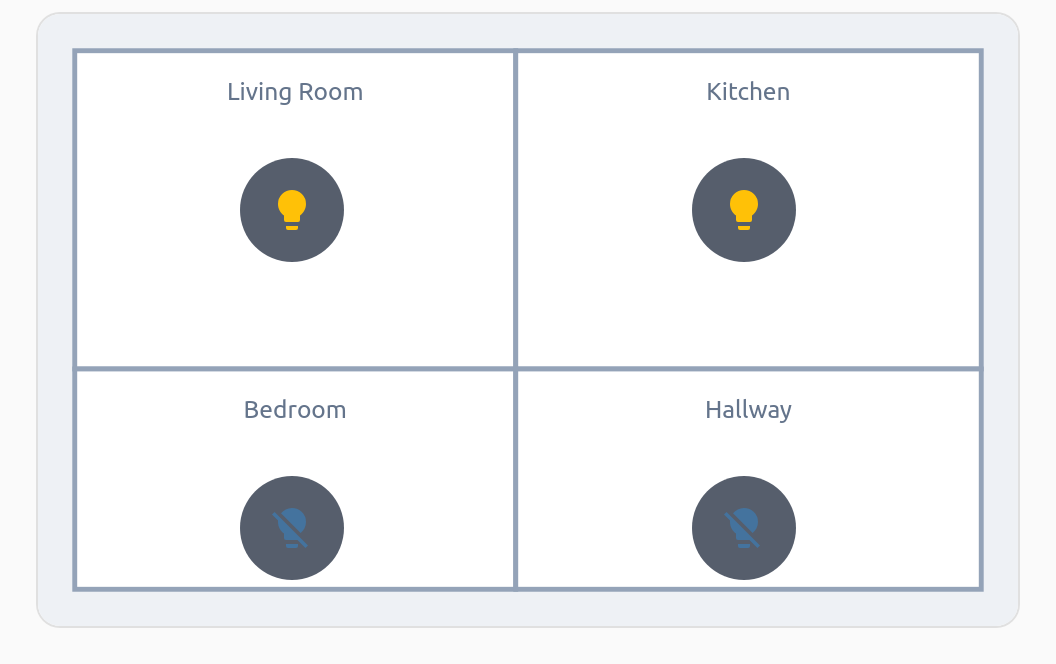
Four markers, one appearance to maintain. The icons pick up their on/off colours from the entity, and tapping one toggles the light.
style means two different things here
This is the one genuinely confusing corner of the card, because Picture Elements uses
style for positioning while this card uses style for CSS injection.
| Where | Type | What it does |
|---|---|---|
style: on the instance, inside elements: |
mapping | Positioning. Consumed by the Picture Elements card — top, left, transform, and so on. |
style: inside the template’s element: |
mapping | Appearance of the element itself, applied on top of the positioning. |
style: on the template, next to element: |
string | CSS injection — see Styling. |
In practice: put the look in the template, the coordinates on each instance.
decluttering_templates:
  room_marker:
    element:
      type: state-icon
      entity: '[[light]]'
      style:                     # <- appearance, a mapping
        border-radius: 50%
        padding: 6px
    style: |                     # <- CSS injection, a string
      :host { --mdc-icon-size: 28px; }
Centring on a point
Picture Elements positions by the element’s top-left corner. To centre it on the coordinates instead, add a transform — and make it part of the template so every marker gets it:
decluttering_templates:
  room_marker:
    element:
      type: state-icon
      entity: '[[light]]'
      style:
        transform: translate(-50%, -50%)
        border-radius: 50%
Element types
element: accepts any Picture Elements element:
decluttering_templates:
  temp_label:
    element:
      type: state-label
      entity: '[[entity]]'
      prefix: '[[prefix]]'
    default:
      - prefix: ''

  room_button:
    element:
      type: icon
      icon: '[[icon]]'
      title: '[[title]]'
      tap_action:
        action: navigate
        navigation_path: '[[path]]'
In other cards’ elements: lists
An element template is not limited to Picture Elements. Any card that draws its overlay
with Home Assistant’s own picture-elements code will accept it, because that code accepts
any custom: element. Advanced Camera Card is one, including inside
its custom:advanced-camera-card-conditional:
type: custom:advanced-camera-card
cameras:
  - camera_entity: camera.kitchen
elements:
  - type: custom:advanced-camera-card-conditional
    conditions:
      - condition: view
        views: [live]
    elements:
      - type: custom:decluttering-card-plus
        template: ptz_button
        variables:
          - camera: camera.kitchen
          - movement: up
        style:
          right: 25px
          bottom: 50px
Positioning still goes on the instance’s style:, just as it does in a Picture Elements card.
Each instance is still one element. A template cannot add several entries to another card’s list on its own. To hand a card a whole list that changes from one dashboard to the next, put the card in a card template and pass the list in as a variable. A placeholder that is the entire value is replaced with the list itself:
decluttering_templates:
  camera_view:
    card:
      type: custom:advanced-camera-card
      cameras: '[[cameras]]'
      elements: '[[elements]]'
Reference
| Key | Where | Type | Description |
|---|---|---|---|
element: |
template | mapping | The element configuration, with [[variables]] |
default: |
template | list | Fallback variable values |
style: |
template | string | CSS to inject |
template: |
instance | string | Name of the template |
variables: |
instance | list | Values to substitute |
style: |
instance | mapping | Position within the Picture Elements card, or any card that uses its elements |